.avif)
Blackridge Advisory
Before and After


Project Overview
Blackridge Advisory
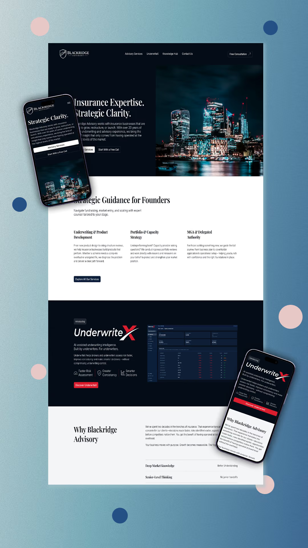
Blackridge Advisory came to me needing their first ever company website, a strategic insurance advisory brand working with MGAs, underwriters, and founders across the market. Mark supplied the logo, brand guidelines, and a mock-up of how he pictured the homepage, which gave me a really strong foundation to work from. I took that starting point and grew it out, developing the ideas further as the rest of the site came together.
This is one of the projects I'm proudest of. It pushed me to go further with animation and interactive detail than I had before, and the site is genuinely elevated because of it. From subtle motion on scroll to interactive touches throughout, every section was built to feel considered and high-end, matching the calibre of the advisory work Blackridge delivers.
The result
Blackridge Advisory now has a website that positions the brand at the senior, high-end level it operates at, backed by confident, considered copy and standout interactive design. The site went live today.
Project Development Journey
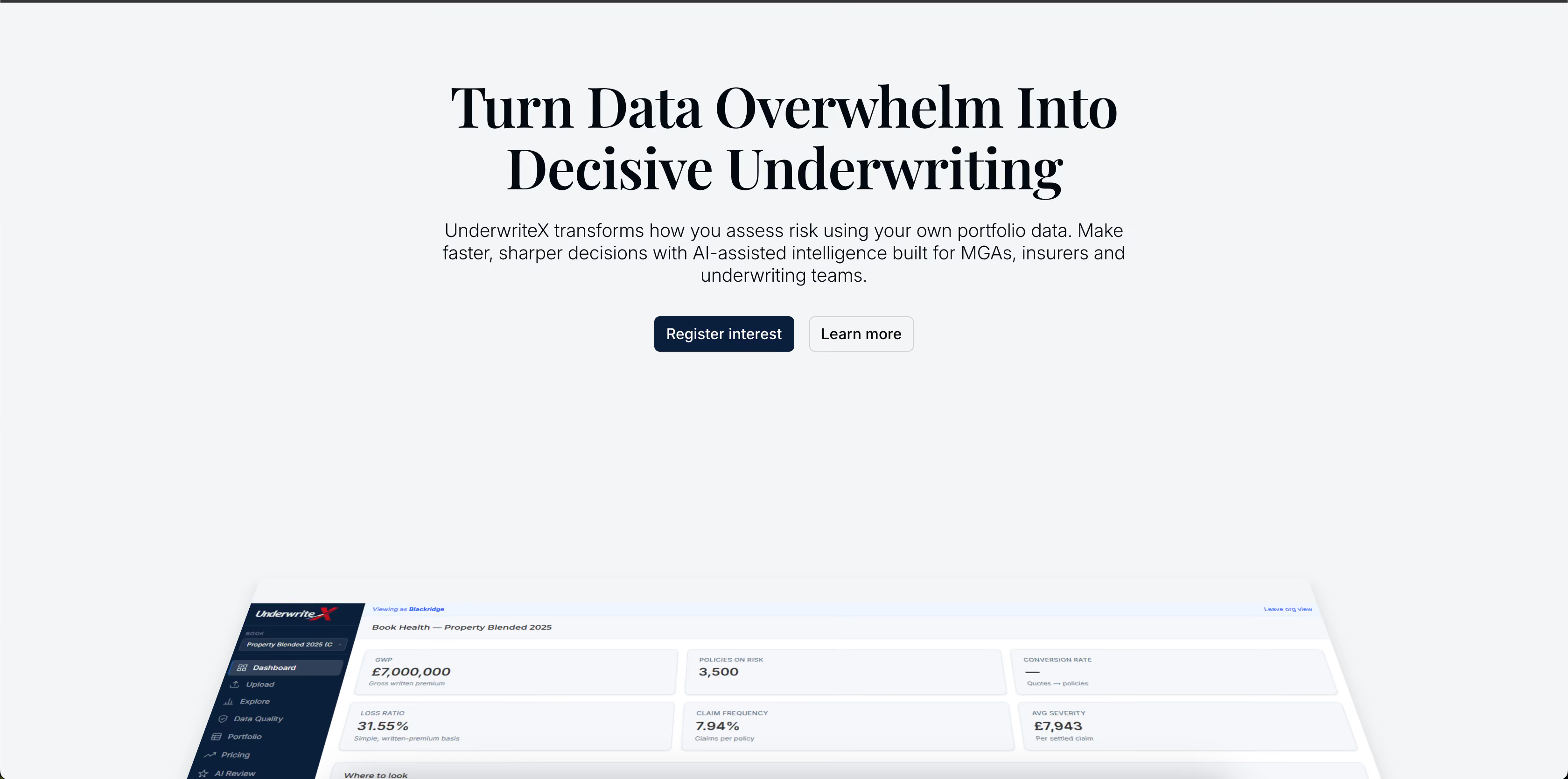
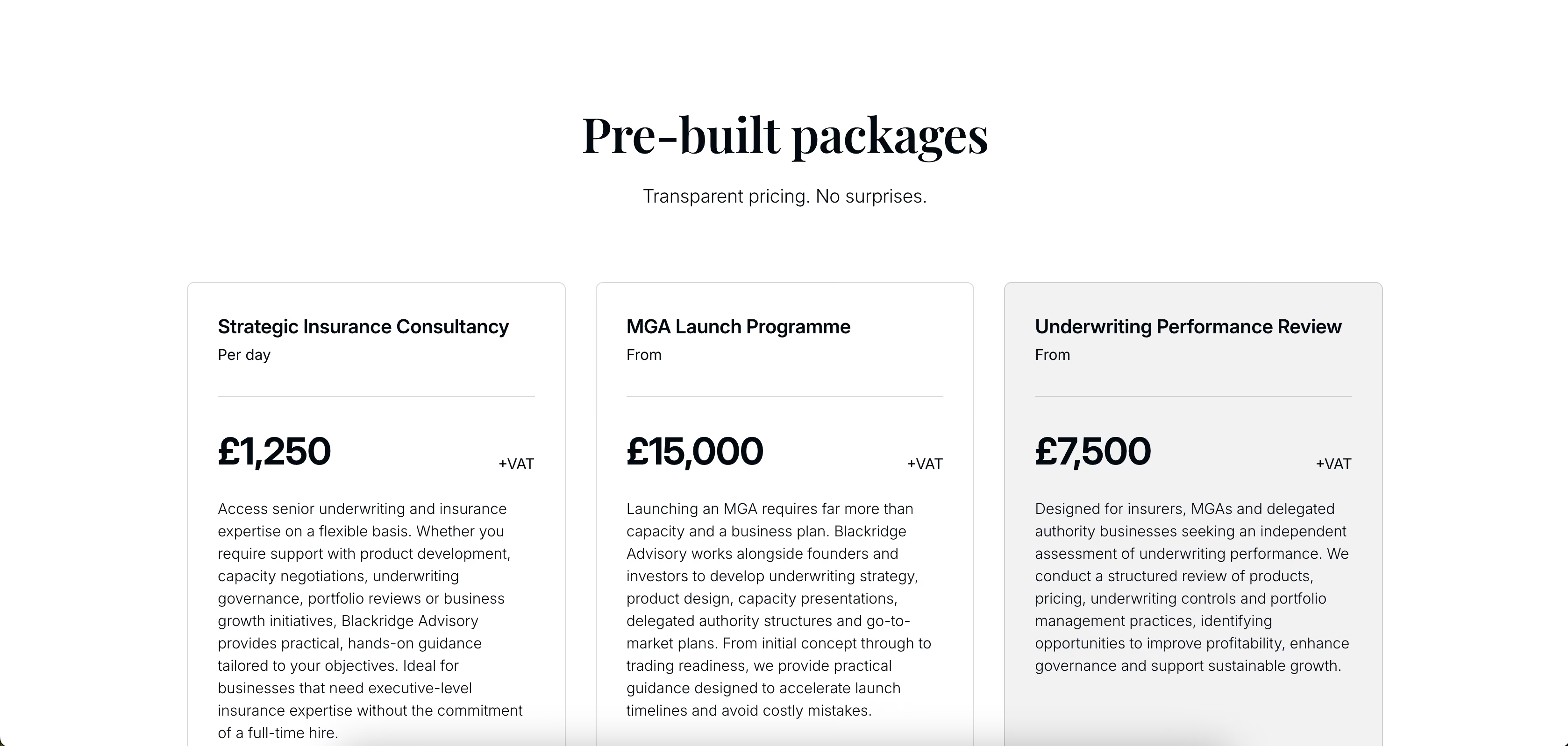
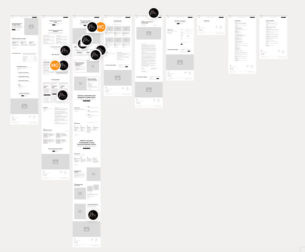
The project followed a discovery call, where I asked detailed questions to properly understand Blackridge's positioning, tone, and audience before any design work began. That shaped the direction the site ultimately took. From there, we moved into wireframes to lock down the content and structure, making sure everything had a clear purpose before it got anywhere near a design file. Once the wireframes were signed off, I moved into designing and developing the site inside Webflow, building out the full experience: the homepage, an advisory services page, a dedicated page for their SaaS product UnderwriteX, a knowledge hub, and a contact page.
Alongside the website itself, I also worked closely with Mark on tone of voice, establishing clear writing rules across the site (Title Case headings, no contractions, no em dashes, a high-end and authoritative register) so the copy matched the same level of polish as the design.
Client Feedback and Reviews
Would you recommend me to others?
How did you find the communication?
How satisfied are you with the end result of the work given?
Overall
Get Started with Your Project
Let’s bring your vision to life together.