.avif)
Andy Watts
Before and After
Project Overview
A bit about Andy
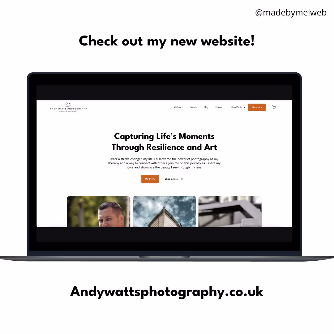
It was a privilege to work with Andy, not only is he a great photographer but he found photography after having a stroke. Now he commits his time to helping others who have had a stroke find a creative outlet to help them through a very difficult time. I was inspired by him and his story that I was sure I wanted to work with him and help him have a website that would help him shine online.
Website goals
When I connected with Andy we spoke about having 2 or 3 user flows he wanted to:
- Promote the physical shop in folkestone
- Sell more photographs online
- Grow his newsletter
- Tell people more about his story and upcoming events
- Be proud to hand people his business card with the website on
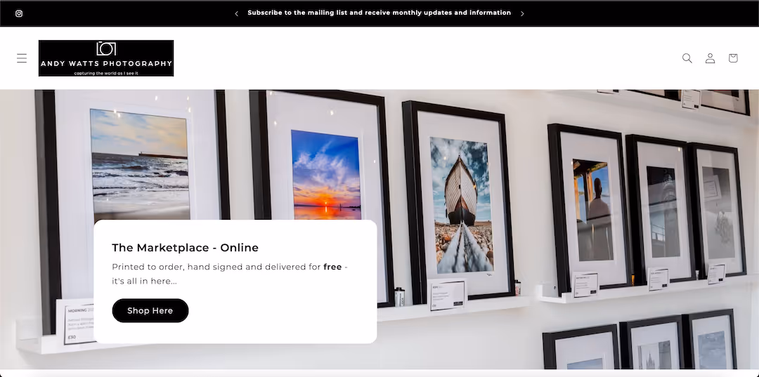
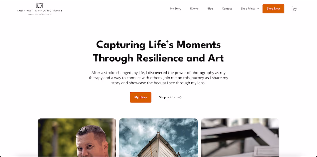
He already had a website but it lacked personality and structure and was hard to navigate through.
Timeline
Project kick off: 11 July 2025
Launched: 11th August 2025
Andy was keen to get the new website up and running for the rest of summer since his shop in folkestone is mostly open during this time period. I managed to complete this project in one month which included:
- New site struture and wireframes
- Adding new colours / fonts
- Re-importing and sorting products from old website
- Feedback loops
- Set up of CMS and Ecommerce
- Launch of website
Project Development Journey
Restructuring the website
Frustration points from previous website
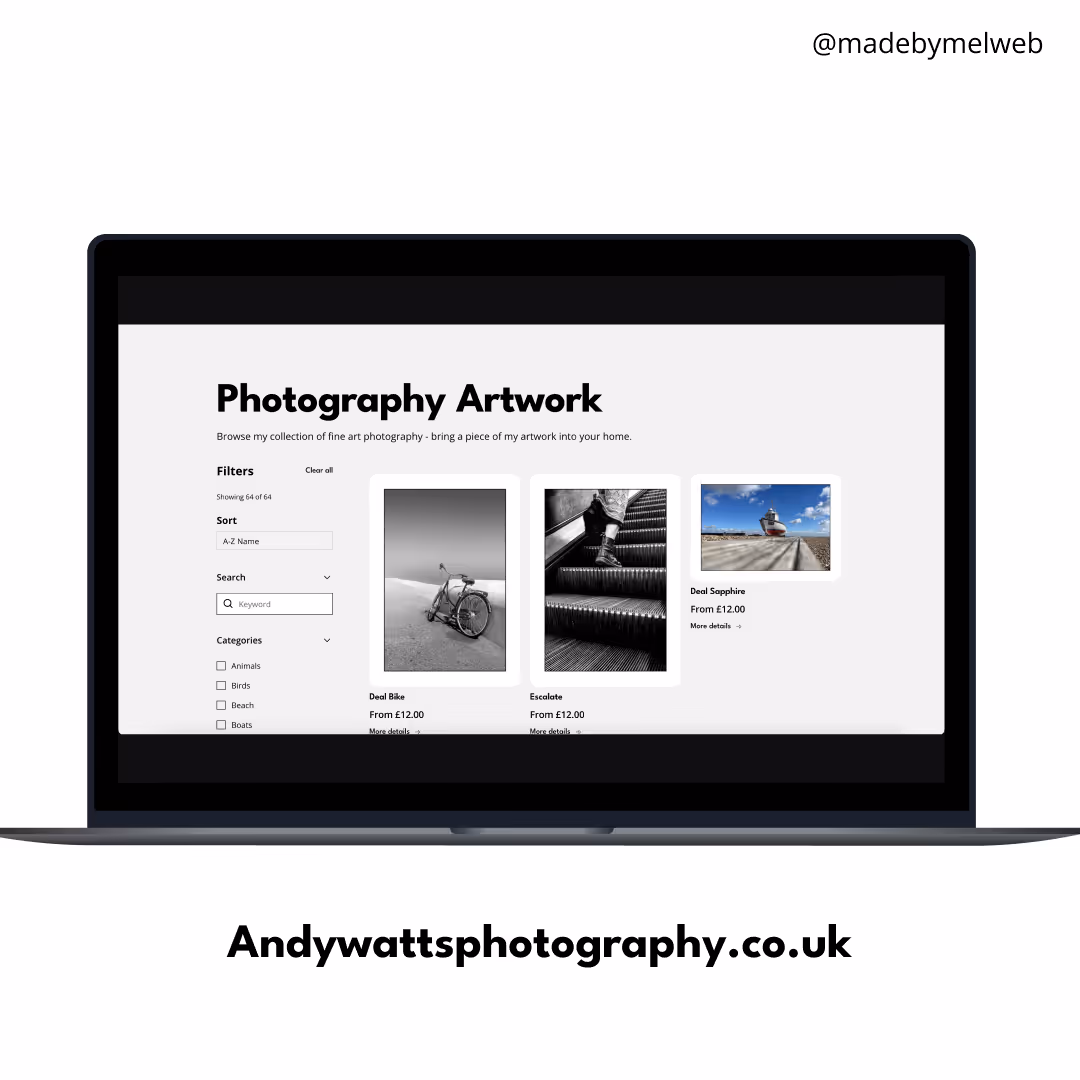
1. Website shop
His previous website shop was hard to navigate through, there wasn't much filtering system in place or easy to 'show all' his products. Furthermore each product was uploaded multiple times for different sizes. This causes frustration for the user and bloat for the website since each row would show the same photograph.
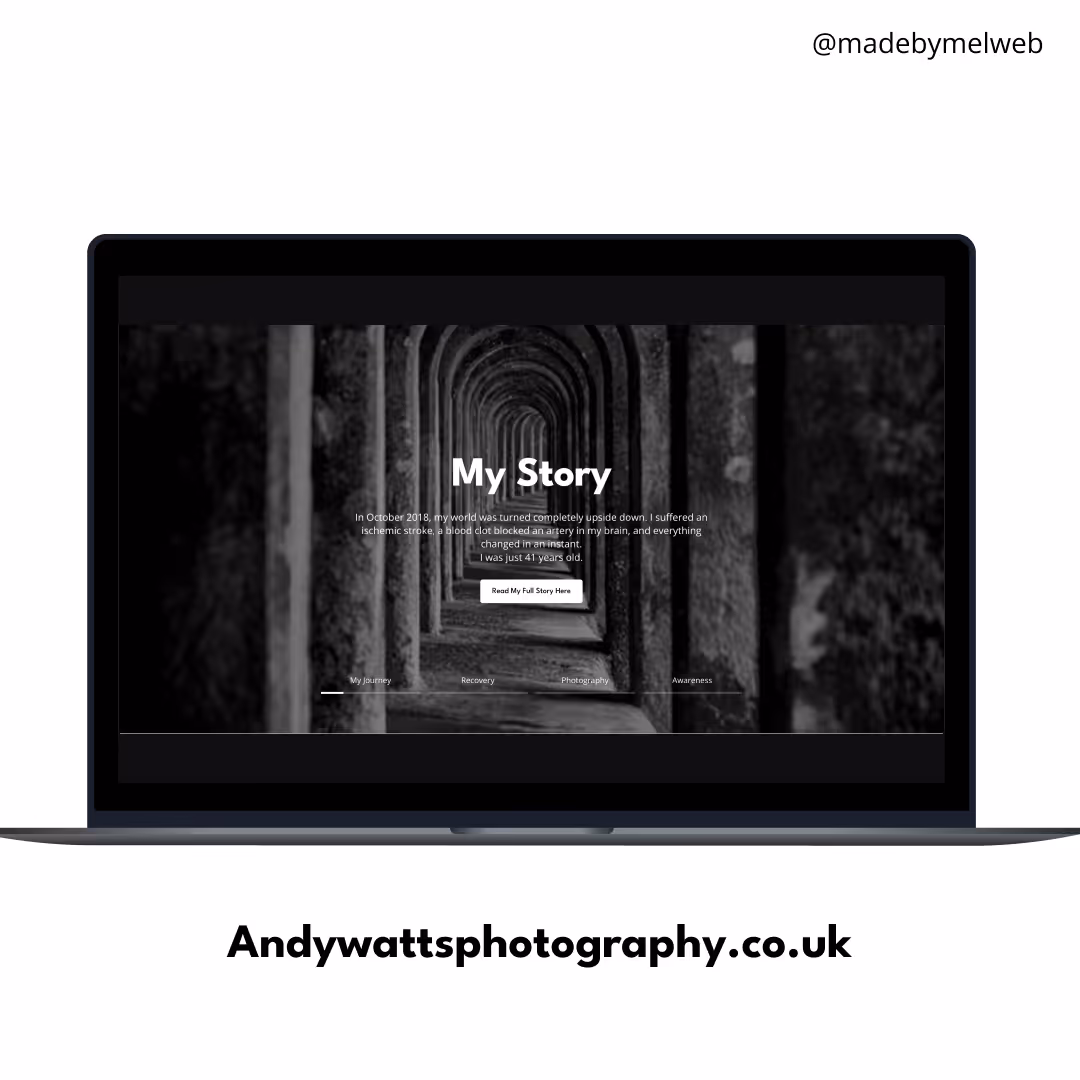
2. His story
Andy's story was spread over multiple pages making it hard to piece everything together. I wanted to make this easier on the new website and follow a linear timeline.
3. Evidence of physical shop
Although his shop in folkestone is mentioned it was only on one page. I knew that I wanted to make this a component across most pages so that updates and adding it to additional pages in the future would be easy.
Structured fixes
1. Fixing up the products
My first priority was to streamline the products into one product using variants making it easy for the user to find the photograph they like(d) and then selecting the right size for their home. Additionally I made more categories and included a filtering system on the shop pages.
2. His Story
I mentioned Andy's story across multiple pages - making sure to make it digestible by using a timeline design. There is also an option to read the long form of his story through the about and blog page.
3. Evidenece of physical shop
Most pages have the section about the physical shop at the bottom of the page making it easy for anyone to:
- Grab the address
- Click through to Andy's google listing
- See opening times
- How to get in touch with Andy
Design changes
Andy has a black and white brand, allowing his photographs to stand out. I added burnt orange additionally to grab the users attention where needed and to tie in with his photographs of the seaside and sunsets. Initially, Andy was surprised that I added the colour but it grew on him and he really liked it when it all came together at the end.
I used league spartan as the heading text to bring boldness to the website and animated the titles to bring some more life and movement into the website.

Client Feedback and Reviews
Would you recommend me to others?
How did you find the communication?
How satisfied are you with the end result of the work given?
Overall
I asked Mel to develop and build a new website for my business. I had previously used a Shopify platform and tried, without success, to build and maintain it myself. Online sales were non existent as the site I had built was difficult to navigate and lacked any real direction. I had an idea in my mind of what I wanted my website to look like and Mel took that vision and created something far better than I could have ever wished for. I used to be embarrassed to share my website details with people but now I am actively encouraging all of my customers to visit it. I now feel confident in my brand, sales have increased and I feel like my business is progressing in a more professional way. I cannot thank Mel enough for all her hardwork and all in less than a month from start to finish!
Get Started with Your Project
Let’s bring your vision to life together.