.avif)
Achilles heal
Before and After


Project Overview
I recently had the joy of working with Carolynee and my good friend Erin (who handled the content writing) to create a brand-new website that truly represents her and the incredible work she does.
The challenges Carolynee faced before
Her old website just didn’t reflect who she was or the heart behind her work. It had never been properly designed—no consistent brand colours, fonts, or style to give it personality. It also wasn’t converting: very few form fills were coming through, and it wasn’t showcasing the new directions she wanted to take her practice.
Carolynee had two big goals:
- To promote her new services in supervision and training
- To create a space for her blog and monthly content, a resource that could offer support and hope to trauma survivors
How we collaborated
One of the best parts of this project was collaborating with Erin. She and I used to work together in a previous job, so we already had a natural rhythm and understanding of how to work as a team. We’d go back and forth in a shared Word doc, editing and suggesting changes until the content felt just right. Then, those words were carefully placed into the wireframes and, eventually, the final website.
Having Erin onboard made my job 100 times easier. This was such a sensitive subject, and she has a real gift with words—clear, empathetic, and thoughtful. I honestly couldn’t have imagined a better partner for this project, and I’d recommend her to anyone looking for support with content.
What we created together
With Erin focusing on the words and me taking care of design and build, we gave her website a complete overhaul. The end result is a site that:
- Feels aligned with Carolynee—it now reflects her warmth, expertise, and professional presence
- Is clear and easy to navigate, so visitors can find the help they need quickly
- Highlights her new services, giving her a stronger platform to grow her practice
- Makes space for her writing, so she can share valuable content with her audience
Carolynee’s first reaction
Her words meant so much to me:
"I am so moved by all you have created and crafted. Such talent. It has an artisan gravitas with visibility and clarity. The thought processes behind this are not lost on me."
My perspective
This project was a meaningful one for me. I had never designed specifically for an audience of trauma survivors before, and it required a different level of care, attention, and sensitivity. Every design choice—from layout to colour to typography—was about creating a calm, safe, and accessible experience.
Carolynee reminded me that the website’s job is simple yet profound:
"If this helps just one person it has done its job."
That sentiment really stuck with me. It made this project feel much bigger than just a website—it’s a tool that will connect people with the help, support, and healing they’re looking for.
I’m so proud of what we created together, and I believe this website will continue to serve not only Carolynee but also the many people who come to her in search of guidance.
Project Development Journey
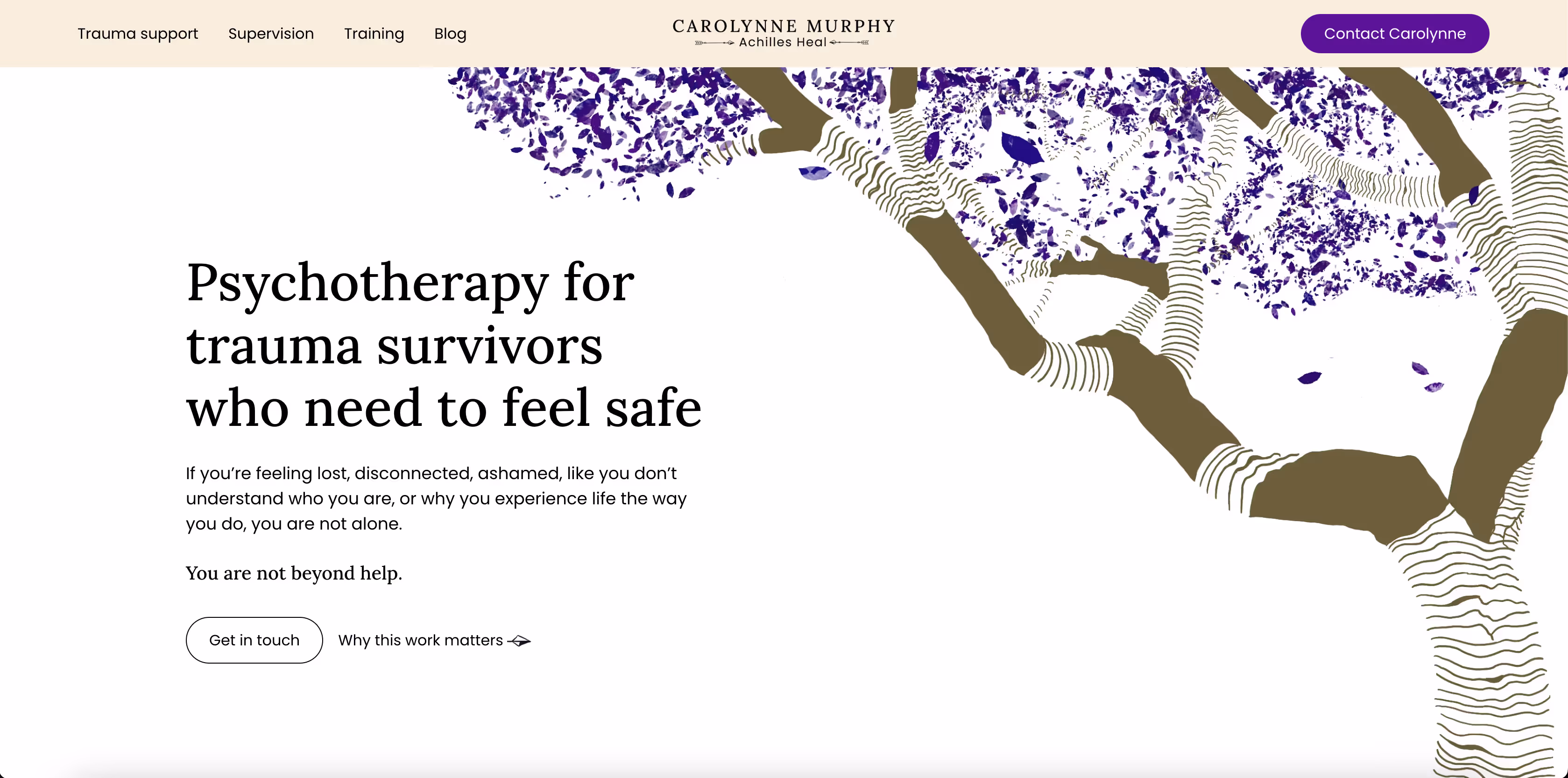
This was the first website where my artistic skills really came into play. Every tree and nature illustration you see on the site was hand-drawn by me using Procreate on my iPad. It was the longest part of the project, but also the most enjoyable—I loved being able to add something so personal and unique to the design.
Carolynee had a clear request when it came to colour: she wanted to use indigo, a colour that represents intuition, perception, and the higher mind. The biggest feeling she wanted the website to communicate was safety. However, when I tried using indigo as a background or in large sections, it felt too bright and overwhelming for the tone of the site. Instead, I wove it into the illustrations—shading the leaves in different tones of indigo—and used it strategically to highlight key elements like buttons.
To balance the richness of indigo, I paired it with #F7EEDE (light gold), a soft neutral shade that’s gentle on the eyes but still complements the depth of indigo beautifully. The result is a colour palette that feels calm, welcoming, and reassuring—the exact feeling Carolynee wanted for her audience.
There was also a subtle nod to the website’s name, Achilles Heal. To tie back to the idea of Achilles, I designed custom arrow icons styled like traditional bow-and-arrows. These were used for secondary buttons and include a hover animation for a small but important detail that adds personality and meaning to the site.
My reflection
This part of the project pushed me in new ways as both a designer and an artist. It reminded me that design isn’t just about making something look good—it’s about listening deeply to a client’s vision, understanding the symbolism they want to convey, and then translating that into a site that works beautifully for the people using it.
For me, this project was proof that when design and storytelling come together with care, the result is something that not only looks good but also feels right—and that’s what truly connects with an audience.

Client Feedback and Reviews
Would you recommend me to others?
How did you find the communication?
How satisfied are you with the end result of the work given?
Overall
Mel understands that website building is a form of exposure. A lesser tech guru would turn such vulnerability into a complex partnership, but Mel does not need to ask: What does it mean to contain a work life within some web frames? By illustrating her skills and honestly considering the dilemmas of going live, Mel has struck upon a bold, balanced way to co-create a website without any sense of artifice.
Get Started with Your Project
Let’s bring your vision to life together.